
Agency Favourite Find | Rebrands That Got It Right
05/02/21
Here at The Agency Creative, we love to seek out inspiring rebrands to keep up to date with the latest design trends. We have decided to put together a list of our favourite rebrands that have occurred within the last year. As branding and logo design is something that we specialise in, we love to see when well-known brands develop their style too.
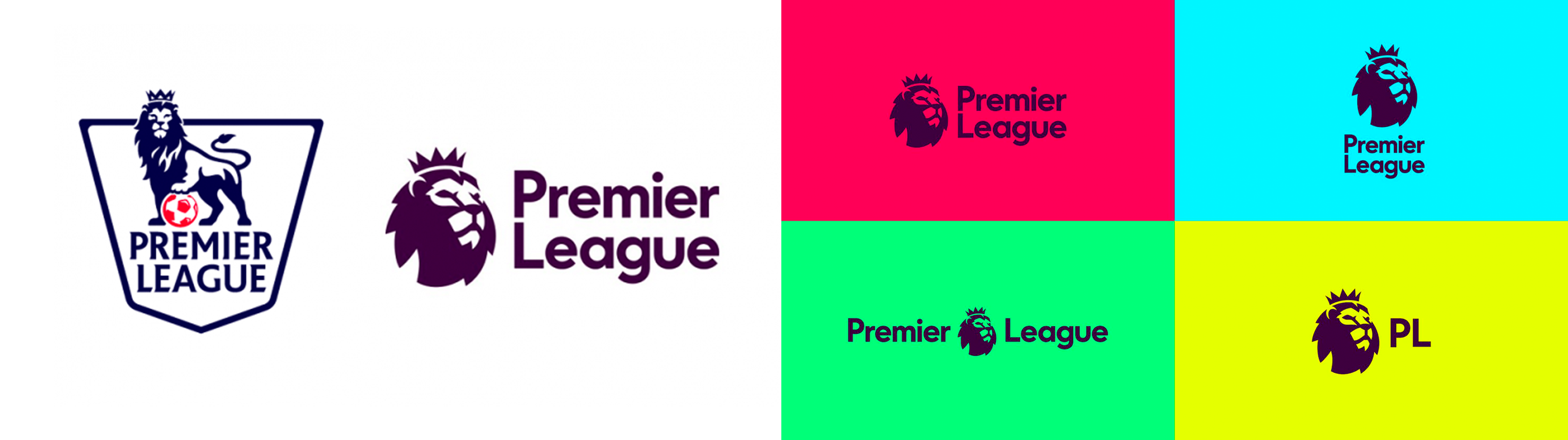
The previous Premier League logo consisted of a lion, a geometric football, a serif font with sharp edges, and a shield. We believe that whilst this logo was memorable it was also too cluttered and compact. The new logo has retained the most important aspects of the old one, as it has a new geometric lion’s head (which appears to be in the shape of a football). The new icon has been paired with a simple and modern font. We feel that the best thing about this logo is how versatile it is. The previous one always remained the same due to the amount of detail it had. However, the new one can be laid out in many ways. The new icon is so memorable that the re-brand is incredibly effective and the name can even be shortened to ‘PL’. Another interesting aspect of this rebrand is its new colours, they are so powerful and vibrant that they complement the geometric shapes of the brand perfectly. The colours also provide an exciting ‘vibe’. Almost like the feeling you get when attending a premier league match!
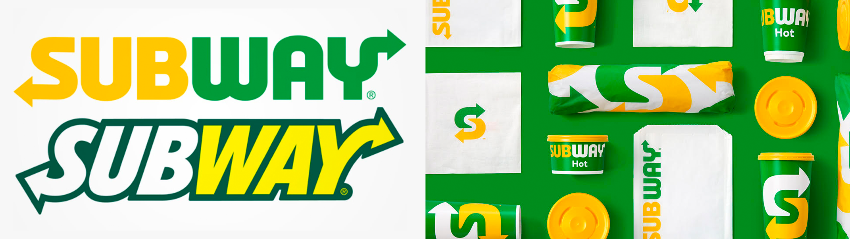
The most fascinating aspect of the subway branding is the use of the arrows. The arrows have become the most distinctive element of their brand, they are now being used across all their marketing as an illustrative design style. Subway has now created a simplified icon using the arrows to create an ’S’. This is incredibly effective as it complements the minimalistic era we now live in. Subways colours are well known to the brand, we believe the new simplistic style highlights the colours in a stronger way than before.
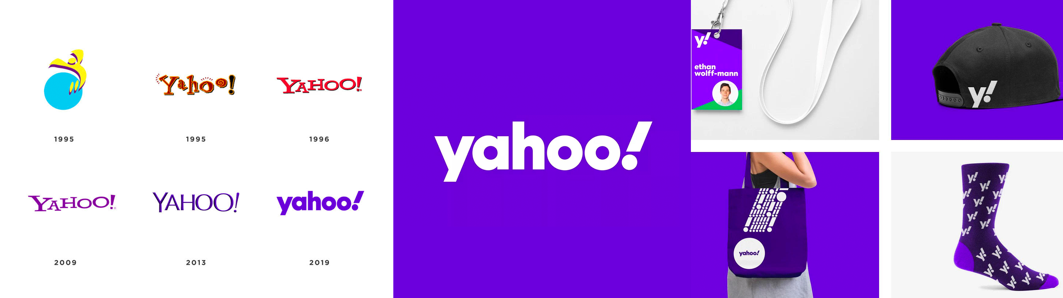
The updated branding of Yahoo Is one of the strongest we have seen lately. This is due to the fact is has become very simple and clean. The use of the italic exclamation mark throughout their branding is what makes this brand stand out. Yahoo has undergone many updates and rebrands throughout the years to keep up to date with new trends and styles. However, the use of their simplified logo this time has empowered the brand massively. One of the most noticeable aspects of this new logo is the choice of lowercase letters. This is becoming more and more popular as it appears friendly and sleek. A lowercase sans serif font is the perfect way to make Yahoo’s new brand stand out. It also forces the exclamation mark to stand out more than it did previously. The ‘Y’ and ‘exclamation mark’ are the perfect pair in their new branding. It makes a new simplified icon that can be used effectively throughout their marketing and branding.
One of the most noticeable changes throughout the android branding is the font update. Originally they had a decorative typeface that reflected on the technical aspects of the company. Androids new font is a rounded sans serif and modern typeface with more legibility. This is more appealing today as it’s easier to read and simpler. Android has paired the new font with part of their original robot icon. This has become the most effective aspect of the android brand. Using the head of the robot is much cleaner and retains the brand’s memorability/values. Android has decided to update their colours, to a brighter / neon green and black. This is much stronger as the modernised colours allow all aspects of the logo to stand out.

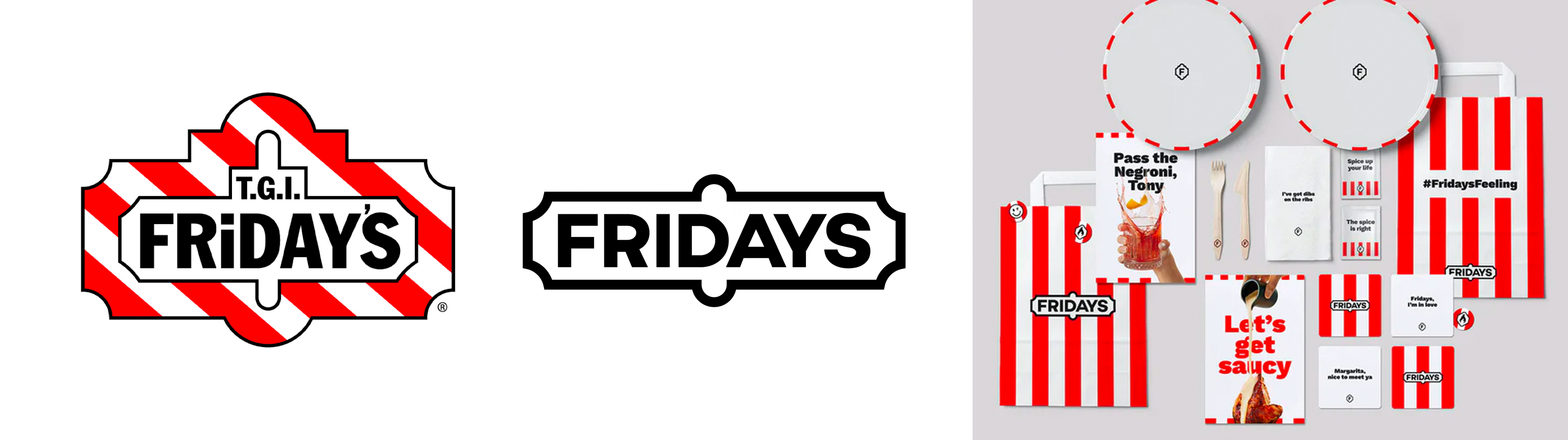
The rebrand for TGI Fridays is very contemporary and clean. The logo has been simplified massively, we believe that this is possible when a company’s name has become so memorable. TGI’s decided to simplify their name for the logo to ‘Fridays’ which we believe works well as it is encased in a simple outlined sign shape, similar to the previous logo. Their new branding is playful and caters to their audience incredibly well. We feel that their new tone of voice has a strong impact on their new style, its clever and humourous. The use of the stripes within their branding instead of the logo has really brought their brand to life.
One for all the designers out there! Adobe’s creative cloud has undergone a rebrand that enhances their brand style. Their new logo portrays their creativity much more, we believe that their logo was incredibly corporate looking before. The new colours create a more intriguing and playful appeal to their target audience. The colours are actually seen to be a visual representation of the applications within the creative cloud. The combination of colours represents the full-service software for creative individuals. The actual icon of the logo has been modernised with ticker rounder edges. The smoother visual is more appealing as it highlights the idea of unlimited creativity.

Nissan’s rebrand has a very clean aesthetic making the new logo a strong visual identity. The logo is more digitally focussed with it being a simplified flat design. We feel that the new logo highlights the original badge impressively. Through the use of negative space, you can still see the old shape of the original badge but the logo is much cleaner. The new logo also allows the text to become the focal point, this creates a strong visual impact for the brand. We feel that this new badge looks great when it’s applied to a car.

This rebrand is one of our favourites! Burger King’s update is the brand’s first complete rebrand in more than 20 years. We believe that Burger King has found the perfect balance between modern and retro. They have recreated one of their previous logos and we are loving the nostalgia! Their new branding seeks to demonstrate its commitment to “digital-first expression,” along with improvements to its food quality and environmental sustainability. We are also loving the fact that Burger King has decided to feature their actual employees within their adverts, tapping into consumer desire for authenticity in marketing. Their packaging has a really strong impact on their new branding as the psychedelic colours and type makes Burger King distinctive against competing brands.
