The Olympics have entertained the world since the first modern Olympics was held in Athens in 1896. Since then, many logos have been designed to visually represent the games. Collectively, these logos reflect the development of design throughout the years. Here at The Agency Creative, we have looked back at all of the Olympic logos and chosen our top 10 favourite designs.
The original ‘interlocking rings’ were designed by Baron Pierre de Coubertin in 1912. Each of the rings represents one of 5 places: Africa, Asia, America, Australia, and Europe. The rings also represent athletes from all over the globe uniting for the games. Many of the Olympic logos have divided opinions, in this blog, we have picked out our personal favourites from a designer’s perspective.
1. Helsinki
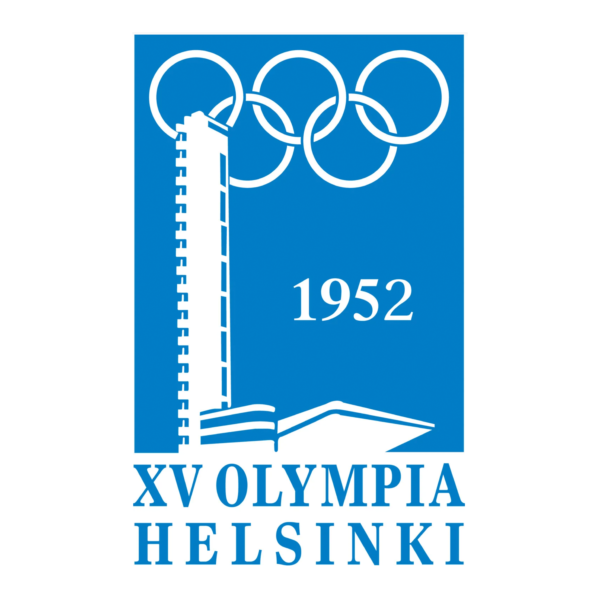
The simplicity of Helsinki’s logo in 1952 is striking. The minimalistic style could easily stand out in today’s world. This beautiful logo was inspired by the flag of Finland. The single-colour design combines minimal type and flat imagery, creating a perfect posterised finish that still looks striking and modern.

2. Seoul
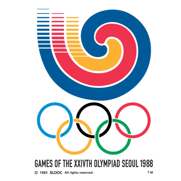
In 1988 the motto for the Olympic games was “Harmony and Progress” and we believe that this logo symbolises exactly that. The curved lines meet in the centre of the logo, this is a great representation of the Olympic games, as athletes from all over the world come together in harmony to celebrate our favourite sports. Simply pairing this design with the Olympic rings is incredibly effective as the curved lines of both sections complement each other well.

3. Moscow
Held at the height of the Cold War, the 1990 Moscow Olympic Games was a big deal for the USSR. Vladimir Arsentyev didn’t just design this primary logo; he created a large document of brand guidelines to accompany it. The bold red distinctively represents the soviet union and the image honours the architecture within postwar Moscow. We believe that the symbolisation within this logo is incredible, the lines resemble race tracks forging a 5 stripe podium. This perfectly complements the 5 Olympic rings. 
4. Sydney
Sydney’s logo was created for the 2000 Olympic games. The bright colours and hand-drawn effects create amazing energy and excitement, perfect to reflect the year of the Millennium. The typography really compliments the icon’s aesthetic making the entire logo fun and friendly. The best thing about this logo is the fact that Sydney’s iconic Opera House is subtly reflected within the athlete’s ribbon/flame.

5. Barcelona
The 1992 logo for the Barcelona Olympic games consists of an abstract emblem representing an athlete and beautiful Spanish colours. We feel that the style of this logo resembles the mosaic patterns and iconic artwork displayed throughout Barcelona.

6. Beijing
The Beijing Olympic logo represents the hosting capital city of China. The emblem appears to be an athlete, however, it is actually a stylised version of the Chinese character jīng ( 京 ) which means “capital”. We love the intelligence behind this logo and the fact that it’s packed with national pride.

7. London
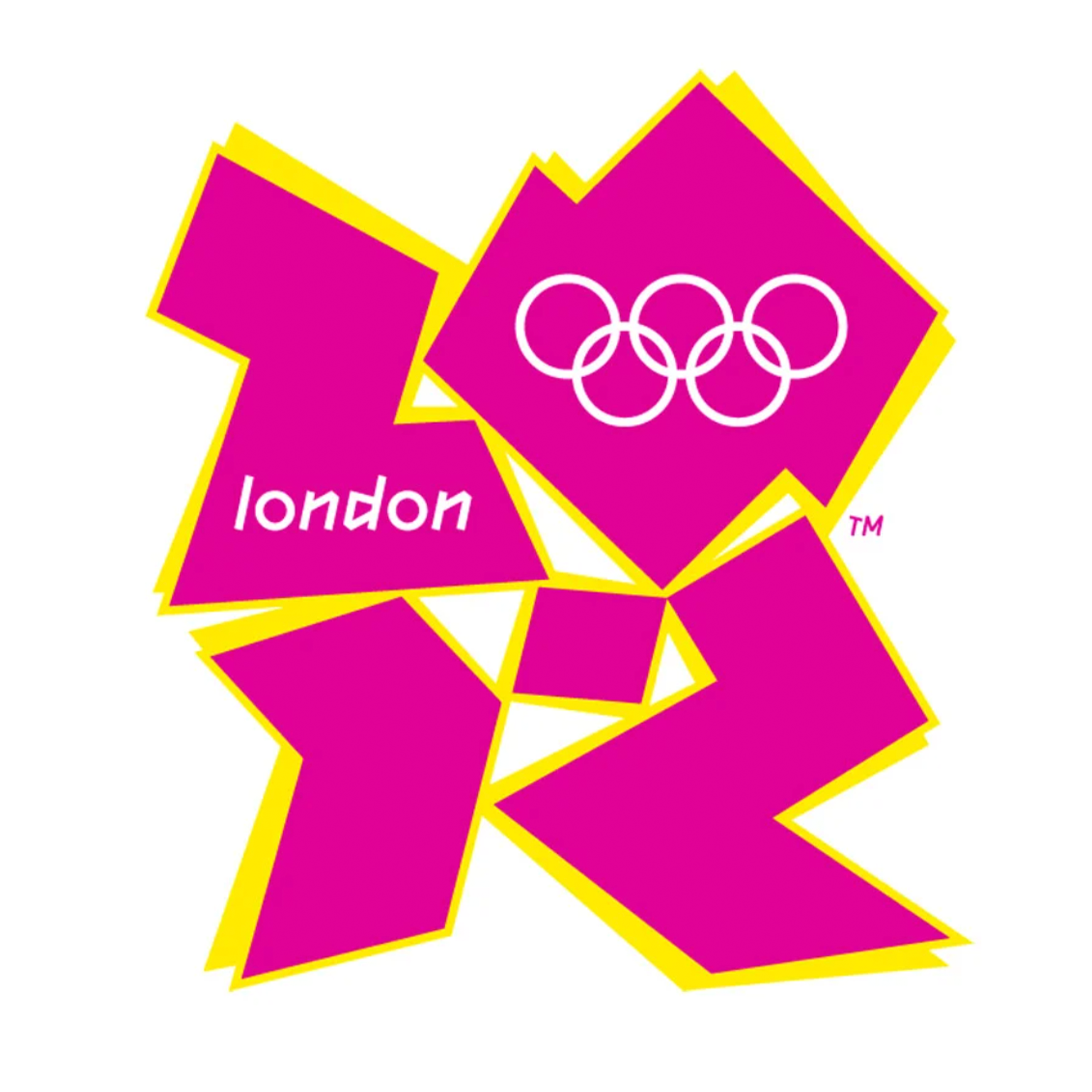
We believe that the style of London’s Olympic logo stands out from the rest due to its diversity and geometric modernism. The placement of the shapes allows the logo to become minimalistic, using them to form the year ‘2012’ meant that the logo did not have to be accompanied by any extra text. Any remaining information is placed within the emblem, creating an incredibly versatile and memorable logo.

Bronze: 8. Mexico
Mexico’s 1968 Olympic logo is still one of the peoples favourites. We believe this is due to its striped typographic style and boldness. This logo makes a statement, its thick black lines resemble the style of native Latin American art. Mexico is the only Latin American country to host the Olympics, so we feel that they have enhanced their culture appropriately through this logo. It is appreciated by the Mexican public so much that they still display this style throughout their country today.

Silver: 9. Munich
In 1972, Germany was a newly democratic country that was excited about a better future. We believe that their psychedelic logo reinforces the 70’s era, especially as it is purely black and white. This logo was designed to resemble a stylised sun, we love the way that the rays appear to get larger with the interlaced spiral. This effect is otherwise known as an optical illusion, a style that was massively produced throughout the ’70s. Munich was among the first to discard the Olympic rings from their logo, however, we believe that they are still represented through the bold circular shape. Glasier described this logo as a ‘Powerful Abstraction’ and we couldn’t agree more.

Gold: 10. Rio
Rio’s 2016 logo is our favourite so far as it really emphasises their tropical culture. Rio is known for its flamboyant costumes, huge festivals, its famous Christ the Redeemer statue and amazing beaches. Due to all this, it’s only fitting that they have a bright and beautiful logo to represent their city. Rio has everything we could wish for including the sun, sea, & fascinating forests, the colours within this logo were chosen to highlight these three stunning elements. Let’s talk about the emblem within this logo, the stunning shape enhances one of Rio’s famous mountains known as ‘Sugarloaf mountain’, it also is a visual of three people joining hands in an interlaced infinity shape, a perfect symbol for unity. We also believe that the position of the people is a great way of symbolising their famous statue. Pairing this emblem with the Olympic rings creates a perfectly harmonised look as each one contains circular shapes. Finally, the typography within this logo emphasises the fun and rounded aesthetic of all elements flawlessly. This logo is a true winner.

Get a fresh perspective on your branding. Call your Marketing & Design Agency in Cheshire on 0161 941 4615 or email info@theagencycreative.co.uk
See our work & services here
